
In this short post, we will learn how to easily create an informative Blocksy mobile menu.
The Blocksy header builder offers multiple options to create a mobile menu.
Most of the important header elements are available with Blocksy Pro.
Creating a Blocksy mobile menu is not a premium feature, but multiple header elements that come with Blocksy pro make it very easy to create an informative Blocksy mobile menu.
About Blocksy Theme
Blocksy is a light weight and powerful WordPress theme.
It has more than 100,000+ active installs on WordPress.
Even the free version of Blocksy comes with multiple features.
Whereas, Blocksy pro has a myriad of features, leaving behind some of the most popular WordPress themes like Astra and GeneratePress.
Blocksy is made using latest web technologies, it is mobile responsive, RTL and translation ready, is SEO-friendly with schema.org, and supports all popular page builders.
Blocksy Header Builder
The free version of Blocksy theme comes with a header builder.
Along with the builder, you also get Blocksy sticky header and transparent header functionality.
But, the Blocksy free version only comes with the following header elements.
- Account
- Button
- HTML
- Logo
- Menu 1
- Menu 2
- Search
- Socials
Whereas, Blocksy Pro comes with many header elements. Check them out in the list below;
- Account
- Button
- Contacts
- Divider
- HTML
- Logo
- Menu 1
- Menu 2
- Menu 3
- Search
- Search Box
- Socials
- Trigger
- Widget Area
That is a total of 14 header elements.
Plus, Blocksy pro gives you a very good feature called Clone Elements.
Because of this feature, it is possible to clone Buttons, Contacts, Divider, and HTML elements.
You can clone and have up to 4 Buttons, 4 Contacts, 8 Dividers, 10 HTML elements, and 4 Social elements.
Take a look at the image below, showing all header elements available with Blocksy pro.
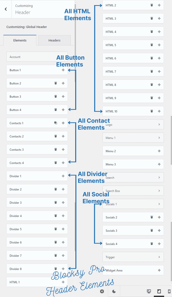
In total, Blocksy Pro comes with a total of 39 Header Elements.
Which Blocksy Header Elements will we use?
I am going to use the following header elements;
- 2 HTML elements
- Mobile Menu 1
- 1 Social element
- Search box
The first HTML element will contain Site identity, i.e., logo and tagline.
The second HTML element will contain the address and phone number of the business with its working hours.
We are going to create a menu (primary menu) and allocate that to Mobile Menu 1
Apply a social element with three social media channels.
Finally, a search box for the visitors to search anything on the website.
Note:- We are not using the logo element for Blocksy mobile menu, because there is only 1 logo element and it is needed for the website’s desktop view.
How To Create an Informative Blocksy Mobile Menu?
Let us begin our step-by-step tutorial of creating Blocksy mobile menu.
Step 1: Create and Add Items to Menu
To create a menu in WordPress, go to your WordPress dashboard.
Hover your mouse on Appearance.
Click on Menus
It will open up the Menus page.
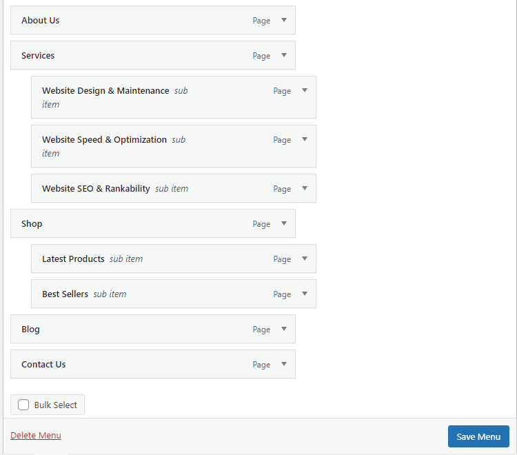
Click on “Create a new menu” and give it a name.
Drag your important pages to this new menu. You can also create sub-items under the main items.
Finally, save the menu.
Have a look at the menu items and sub items I’ve created for allocating to Mobile Menu 1.
Step 2: Allocate the Menu to Header Menu 1 and Mobile Menu 1
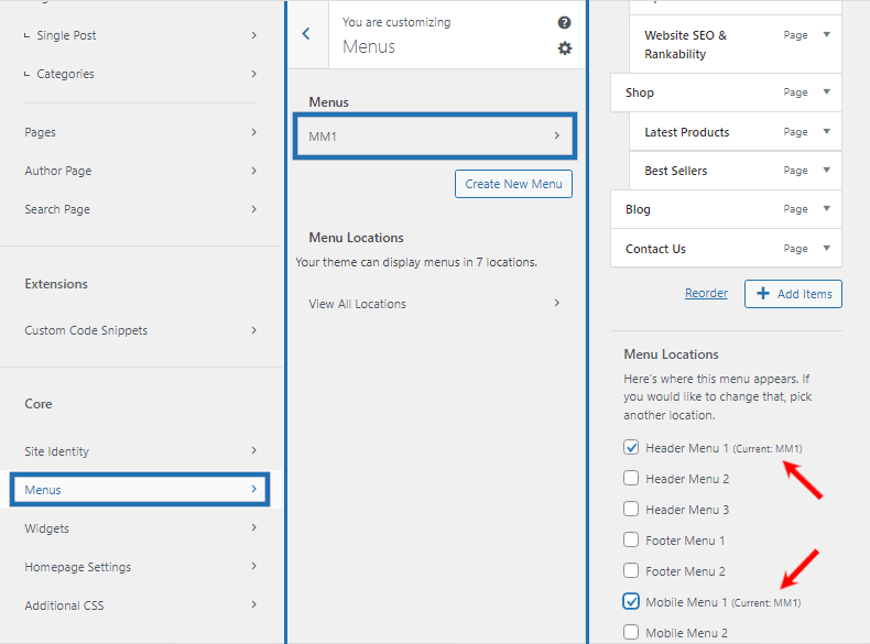
For allocating the menu, you need to go to the Blocksy theme customizer.
Hover your mouse on Appearance.
Clicks on Customize.
Now, go down and click on Menus.
You should be able to see your recently created menu.
Click on that, it will show all menu items and sub-items.
Come down a little and select the Blocksy header menu locations.
In the below image, I have checked Header Menu 1 to make this menu appear on desktop devices and Mobile Menu 1 for mobile and tablets.
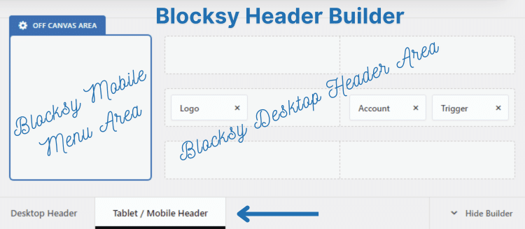
Step 3: Add Header Elements to Blocksy Mobile Menu
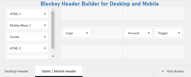
The Blocksy mobile menu is nothing but mobile header. To add header elements, you must go to Blocksy’s theme customizer.
Then, under the header builder click on Tablet/Mobile Header.
This will open up Blocksy’s Off Canvas Area.
You have to drag the required header elements in this Off Canvas Area to make all the elements visible on a Blocksy mobile menu.
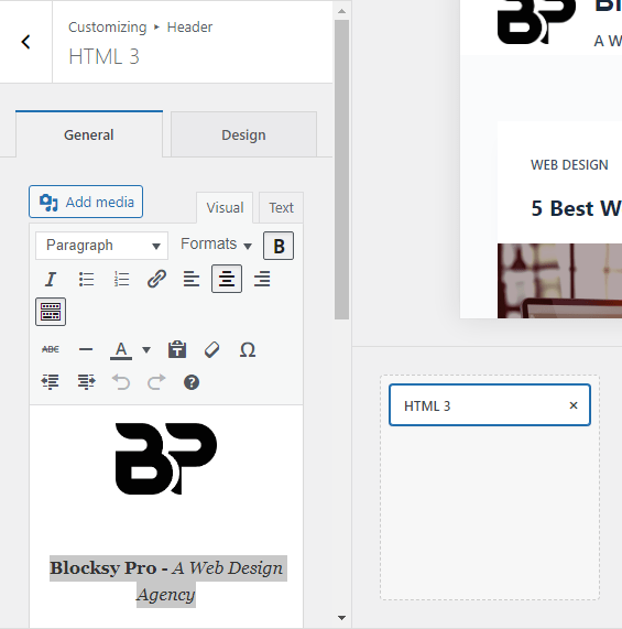
I will drag the first element, HTML 3 and put it into the off canvas area. It contains the site’s logo and tagline.
The name of the website is in bold, while the tagline is set to italics.
Since, the background color of the Off Canvas Area is black. I have set the font color to white.
Take a look at the image below.
Now, drag the Mobile Menu 1 header element.
We have already allocated our custom menu to it in the previous step. So, you do not need to do anything further.
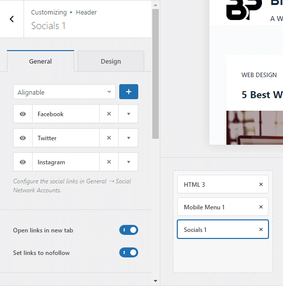
Next, drag a Socials header element and enable the features “Open links in new tab” and “Set links to nofollow”
Important: Make sure to clone that element before using it. You will need another social element for your desktop header as well.
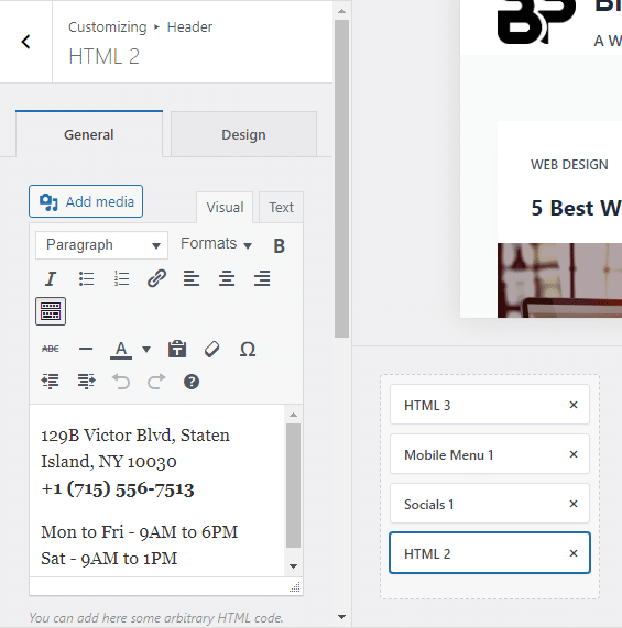
For a business that is having a physical location, adding address, phone number, and working hours is good for the visitors.
Plus, it also helps in local SEO.
Therefore, I’m going to drag another HTML element to Blocksy’s Off Canvas Area.
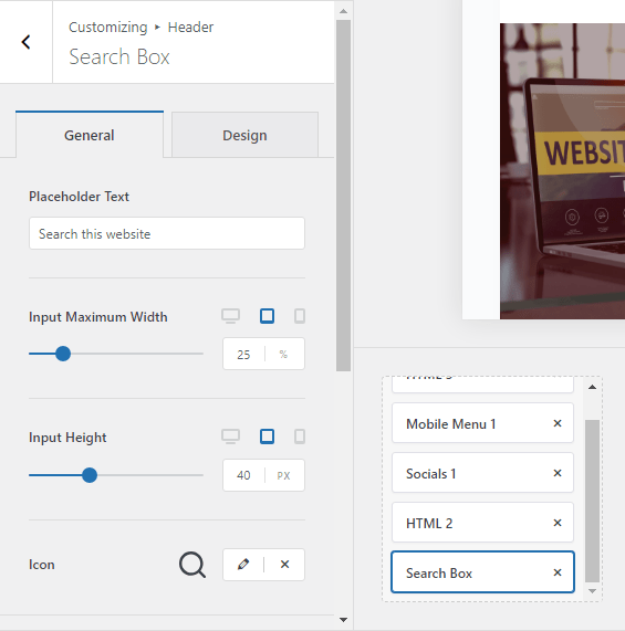
Since, there isn’t enough space for users to search anything on a mobile phone, we will finally add a search box in the off canvas area.
Drag the search box element.
With this, we have added all the required elements to our Blocksy mobile menu.
Hit publish before leaving the theme customizer.
Step 4: Verify the Blocksy Mobile Menu on the Frontend
By default, the off canvas area displays all the contents throughout your website.
So, you should be seeing all the header elements.
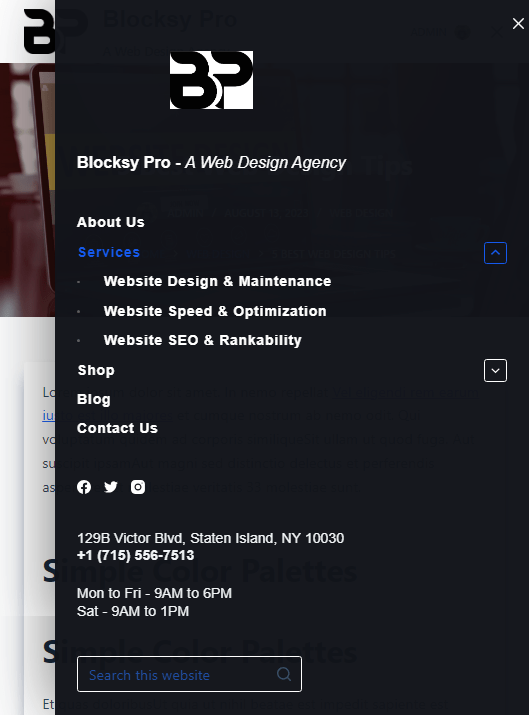
Doesn’t this look beautiful?
Well, it does.
Everything is neatly arranged. Of course, you will need to tweak some padding, margin, font size, colors, etc. according to your layout and brand positioning.
So, we have completed creating an informative Blocksy mobile menu with almost all business information for the website visitor.
Conclusion
This was a very easy tutorial. I hope you will try it on your website projects.
If you are creating a Blocksy mobile menu for a membership site or a WooCommerce website, you can also include the Account header element in the off canvas area.
It is difficult to include lot of information in the mobile menu of the free version of Blocksy. As you do not get the Clone Element feature.
If you are using the free version of Blocksy, it is difficult to include a lot of information, since Blocksy free version does not come with Clone Element feature.